No products in the cart.


Fall Leaf | Take & Paint
Price range: $4.97 through $9.97
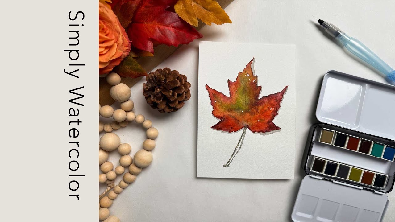
The air is crisp and the feeling of autumn drifts in with this single leaf, glowing in rich tones of red and orange — a small but vivid reminder of the beauty this season brings.
Follow the instructional video for this hand-sketched prompt and Simply Watercolor wherever you are.
Printed on: 140lb watercolor paper in waterproof ink
Available in: 5×7, 8×10 and 5×7 Card w/envelope
Description
Gather your favorite watercolor supplies along with a Take & Paint, and enjoy a moment of creativity.
SUBSCRIBE to my Youtube Channel for more instructional videos.

A completed piece for inspiration or make it uniquely yours.

SUBSCRIBE to my Youtube Channel for more instructional videos.
Application:
- Use wet paint on dry paper for clean, defined edges (wet—on—dry), or apply a thin layer of clean water to an area first and then drop in paint to create soft blends (wet—on—wet).
- To add texture or depth, drop more pigment into a wet area–either in the same color or a different one–and watch it disperse naturally.
- Let the first layer dry completely before adding another layer of the same color for more saturation, or layer a complementary color to create a new color or added shadows.
- Avoid painting directly next to a still—wet section to prevent colors from unintentionally blending. Instead, let one area dry before working beside it. Work from left to right and top to bottom when possible to avoid smearing or resting your hand in wet paint.
- To “erase” a mistake, press a small area of a paper towel over the area to lift the pigment. Alternatively, use a clean, wet brush to loosen the paint, then blot it gently. Be careful not to disturb nearby wet areas. Always let the paper dry fully before reapplying pigment–otherwise, the new paint may bleed into the damp spot.
Color Mixing:
- Activate your pan colors by adding water, then load your brush and transfer pigment to your palette’s mixing area. Repeat with other colors.
- Clear your brush on a paper towel between each color transfer to keep your pans clean. Mix two colors gradually, blending a little at a time to achieve your desired hue.
- Use your palette to experiment and adjust tones as needed and add water to create a lighter value.
- To deepen a color, mix in a small amount (e.g., 1/4) of its complementary color. For example, add a bit of green to red to darken it, or red to green to deepen that tone.
- Adding a touch of brown to bright colors can tone them down–just be cautious: too much brown can make colors look muddy. Less is more.
- To create gray or black, mix a dark blue with orange (start with about 3/4 blue to 1/4 orange). Adjust the ratio based on the pigments in your set. Add more water to lighten the mixture and create a silvery gray.
About the Artist | Tamery Stafford
I have a Fine Art degree from SCAD; I am an interior designer by degree. I opened my own business, the Tamery Stafford Gallery | Studio, to sell my large, acrylic commissioned art and offer watercolor class experiences. I’m inspired by images that create a certain mood, which prompts me to hand—drawn motifs for myself and others to Simply Watercolor. I have now taught hundreds of people, new to watercolor, how to fall in love with the medium. For me, watercolor is a simple, relaxing escape, a way to slow down, unwind, and enjoy being creative. My heart is to Make Life Beautiful, one brushstroke at a time.
Additional information
| Product options: | 5×7, 8×10, 5×7 Card w/envelope |
|---|
Related products
-


Whimsy Garden | Take & Paint
Price range: $4.97 through $6.97 -


VW Van Sunset | Take & Paint
Price range: $4.97 through $6.97 -


Hedgehog | Take & Paint
Price range: $4.97 through $9.97